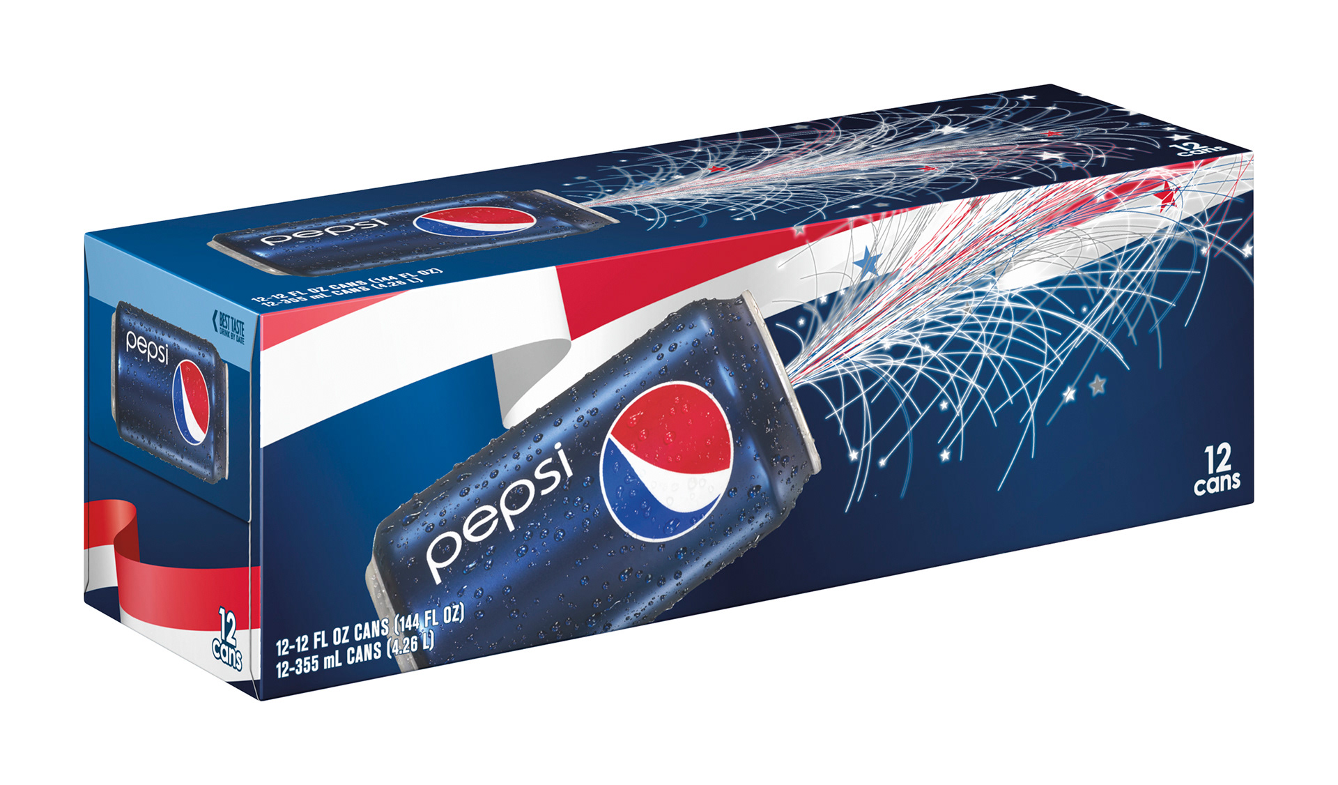
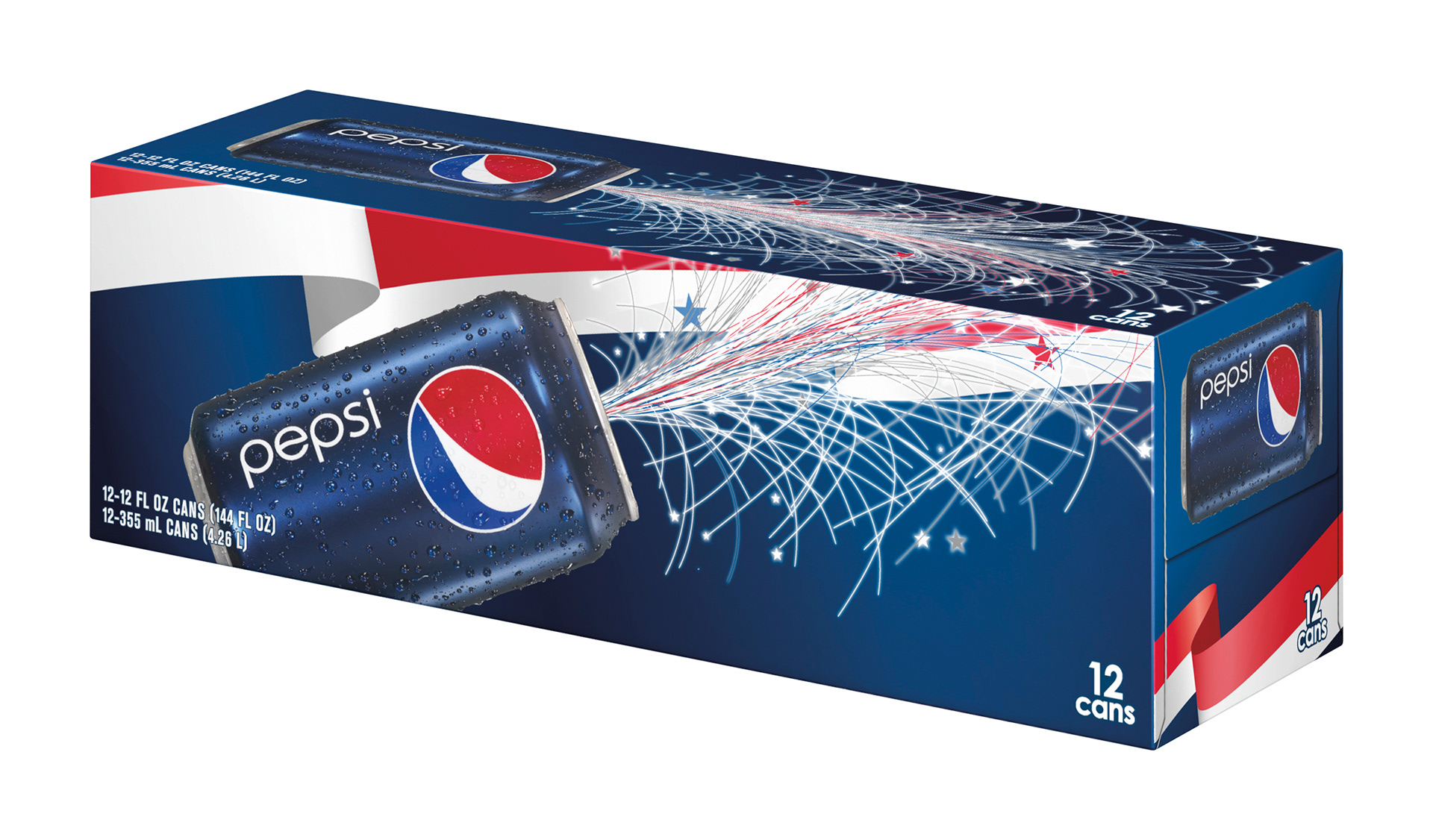
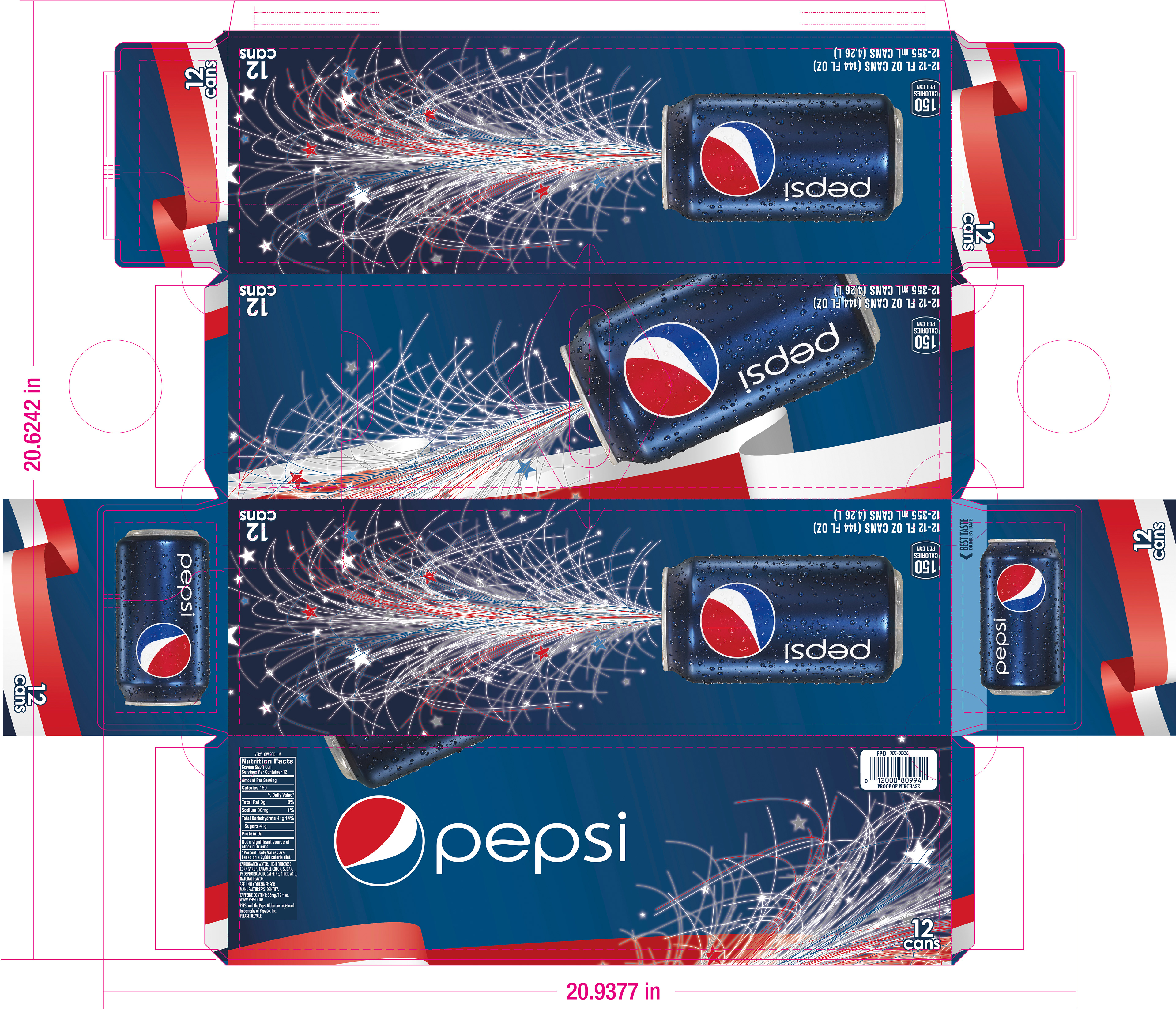
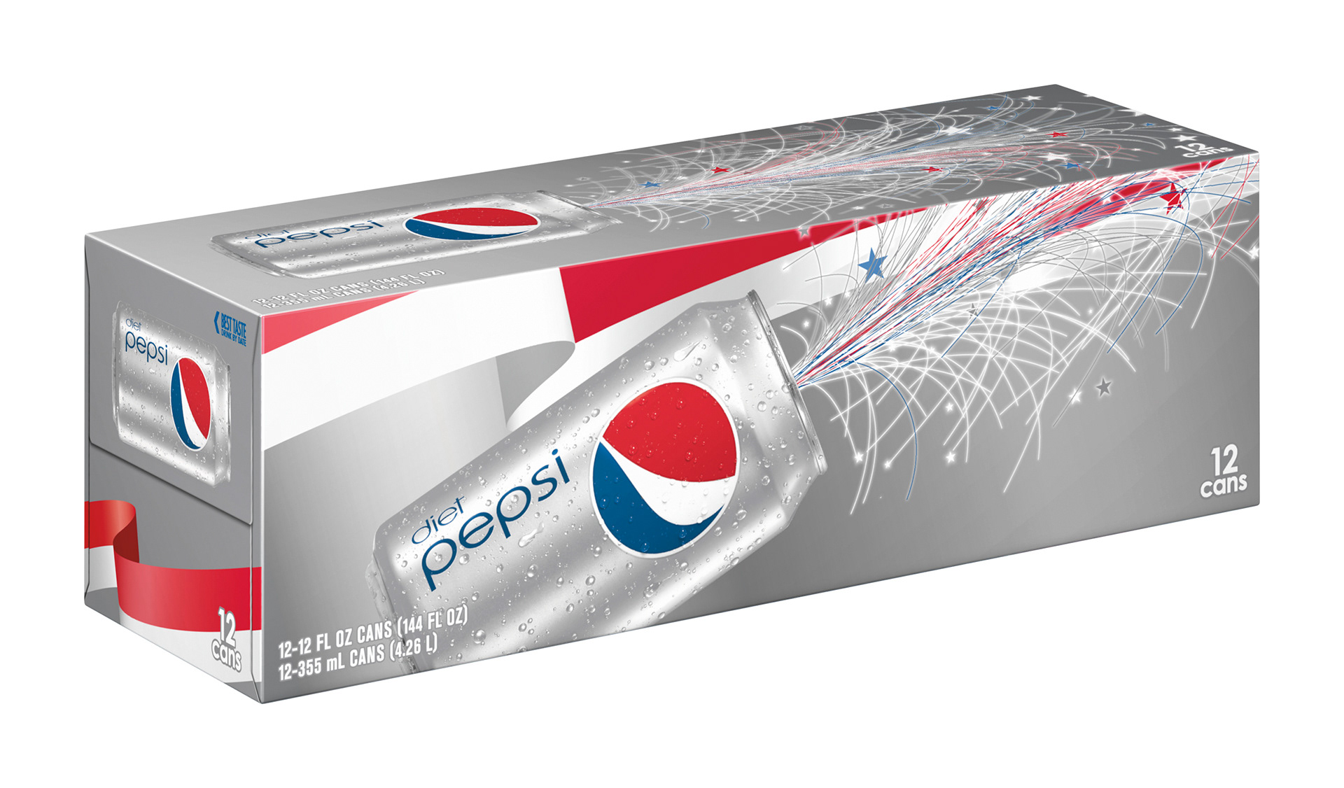
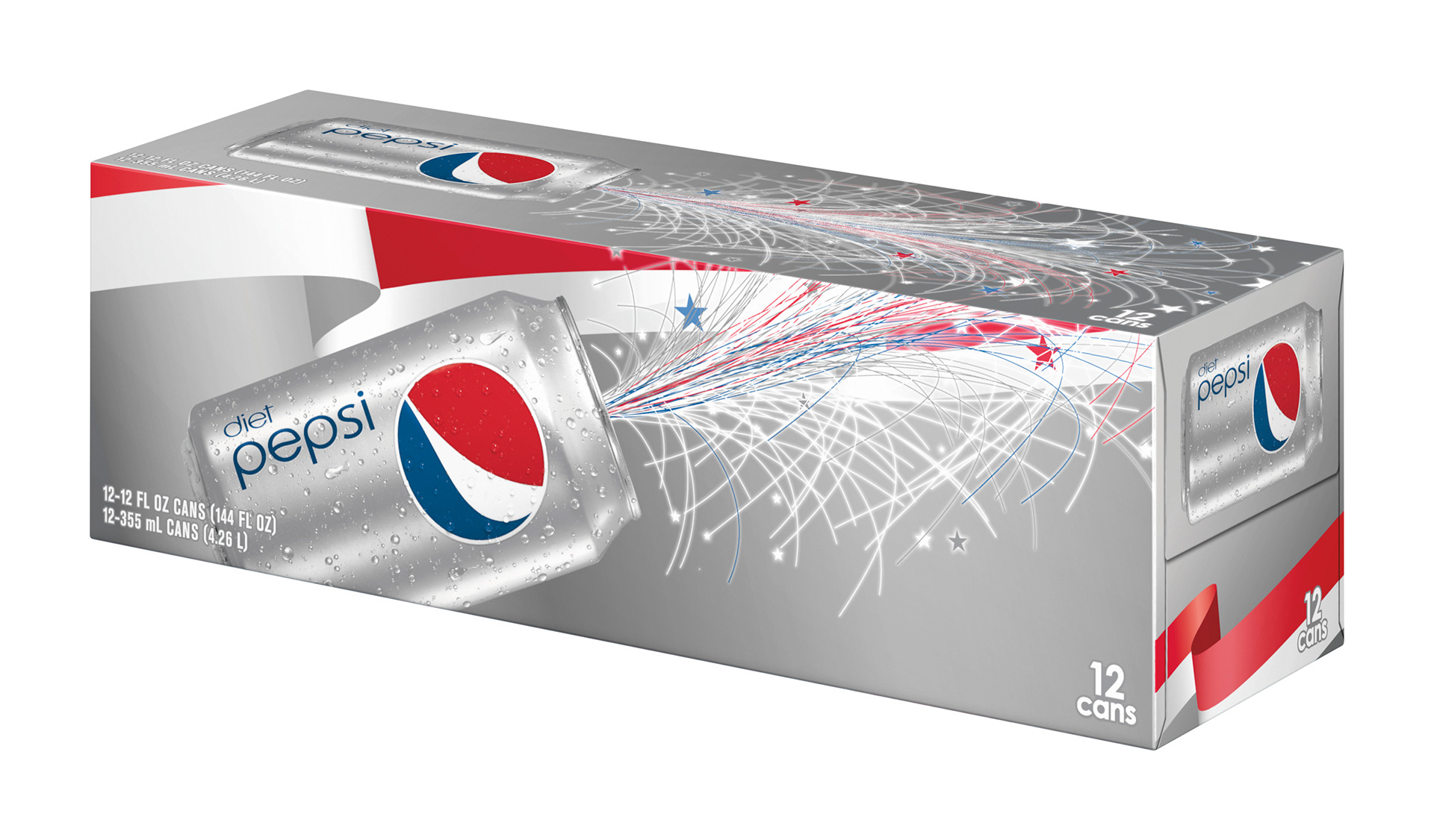
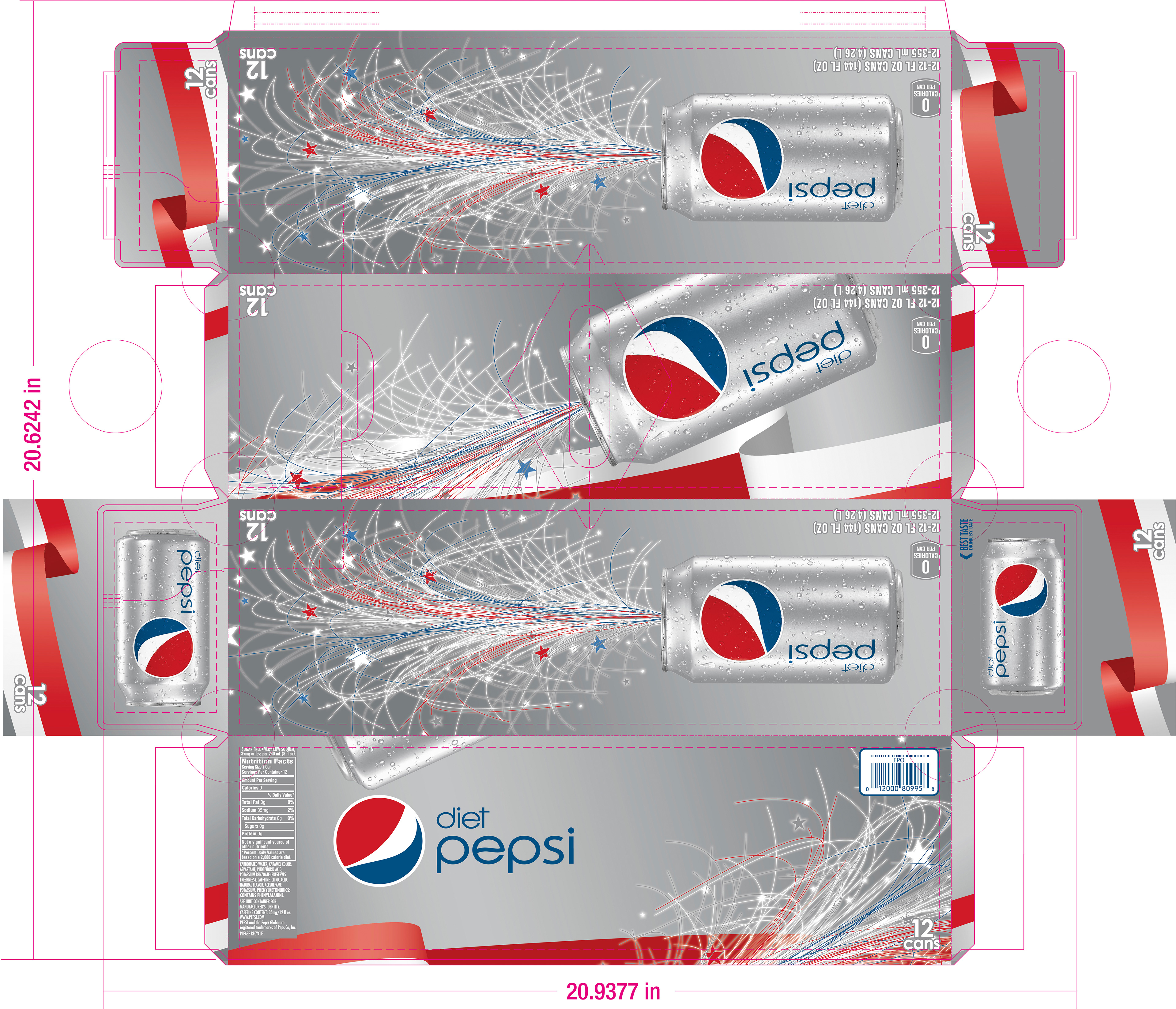
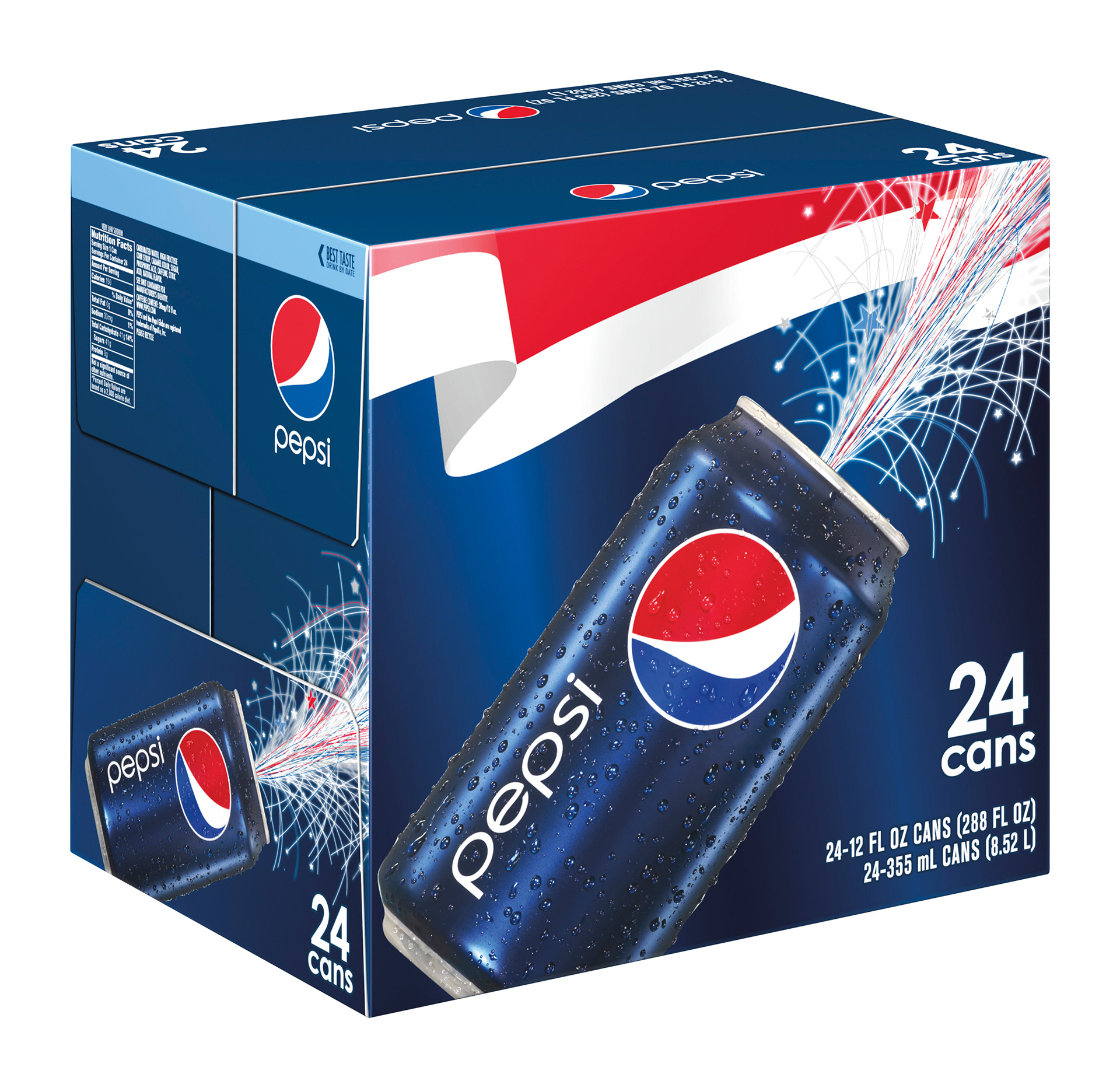
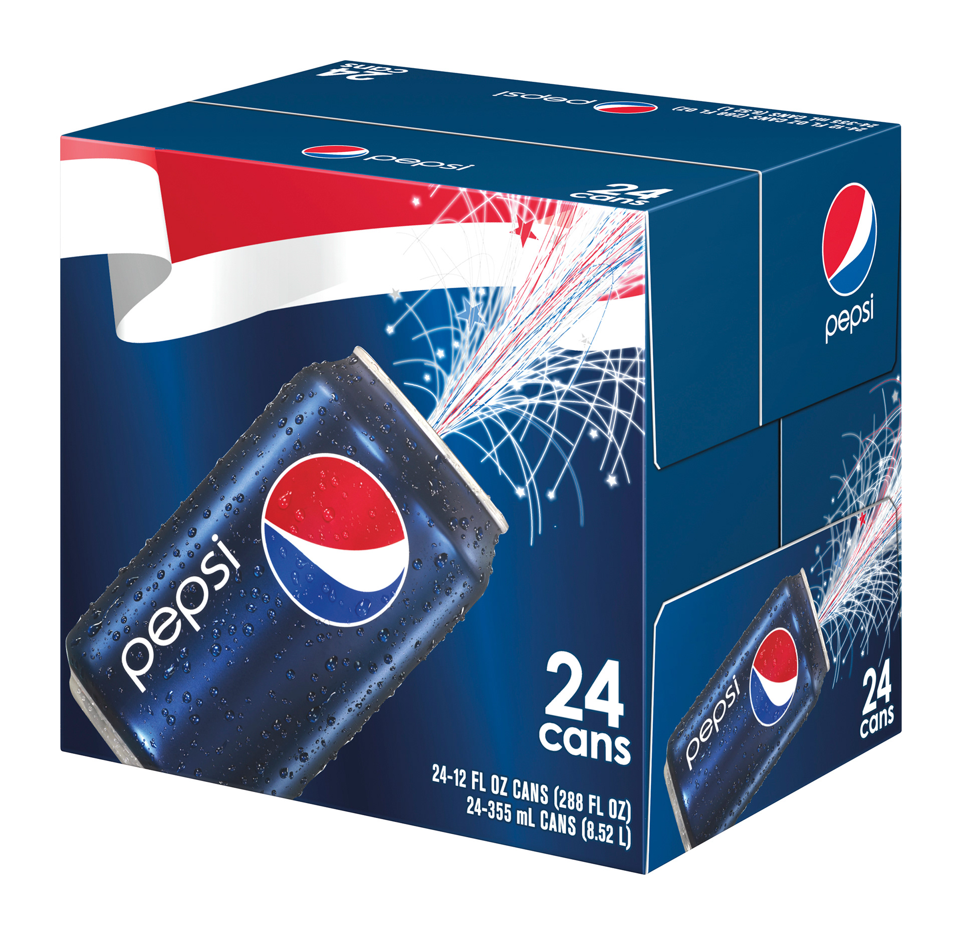
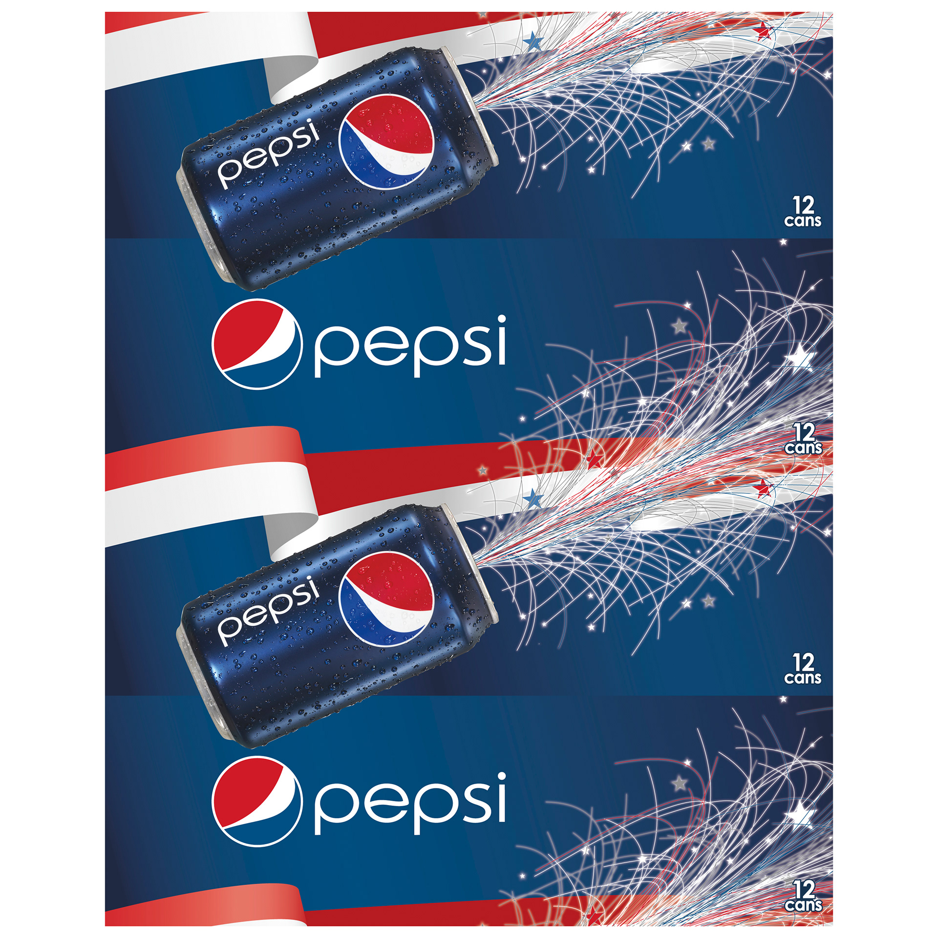
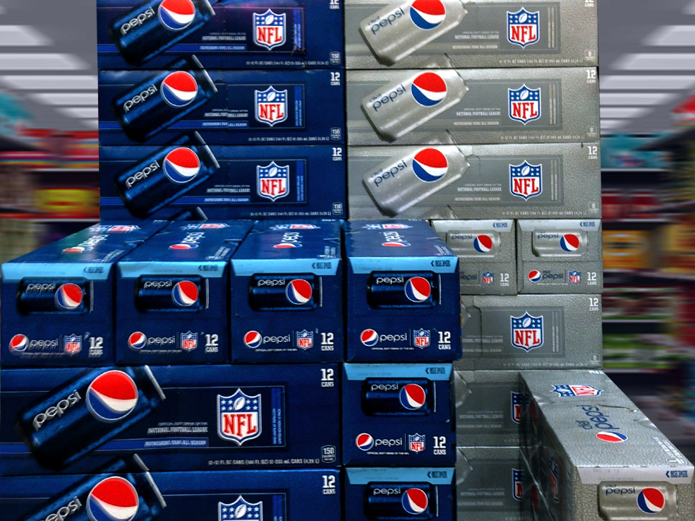
PEPSI FOURTH OF JULY
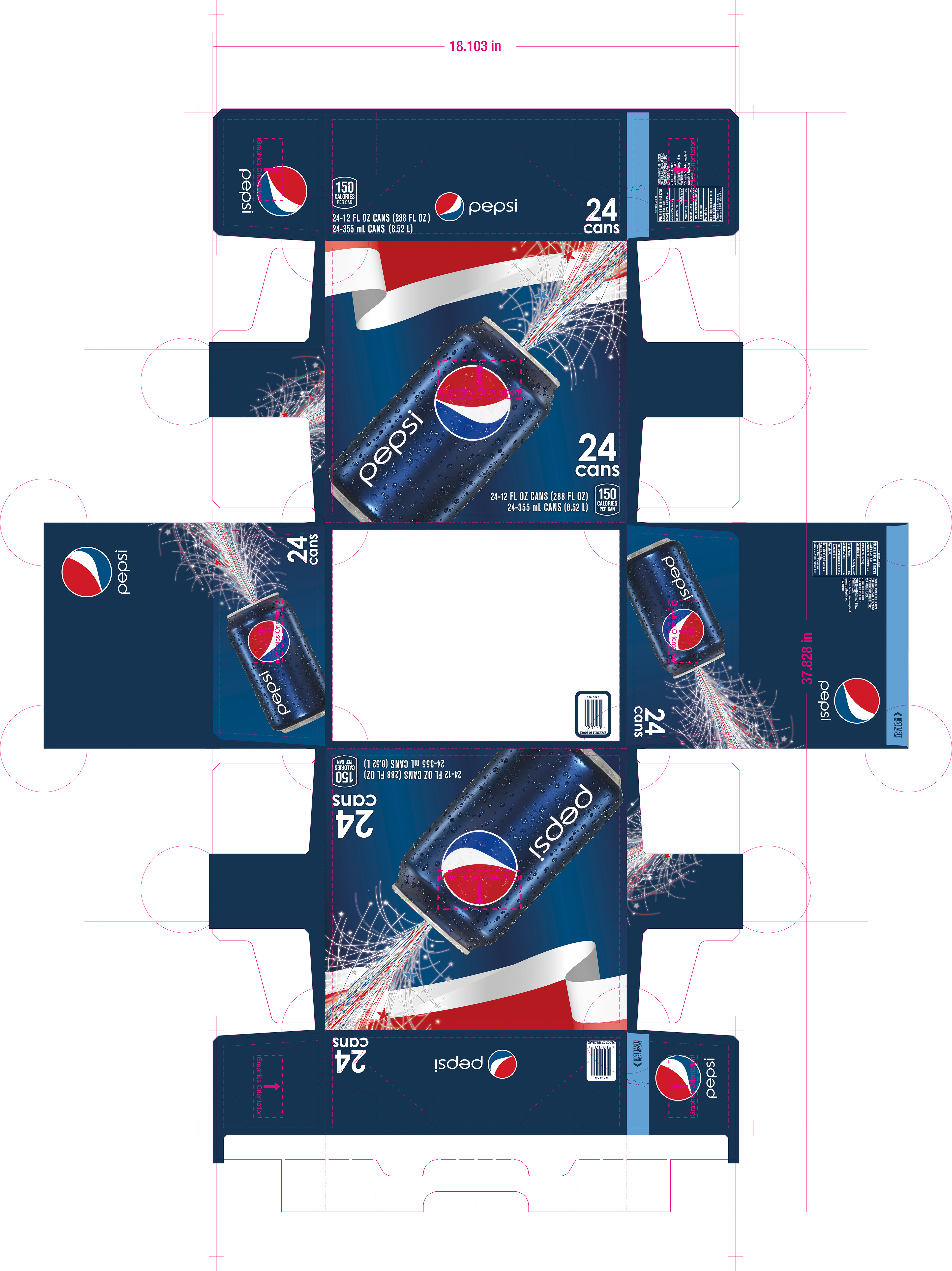
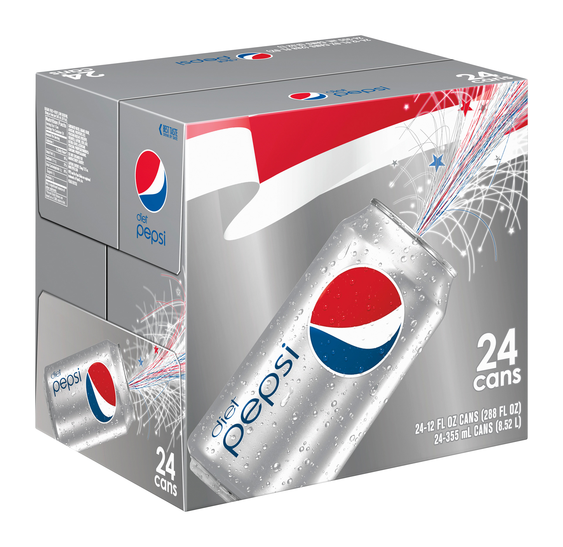
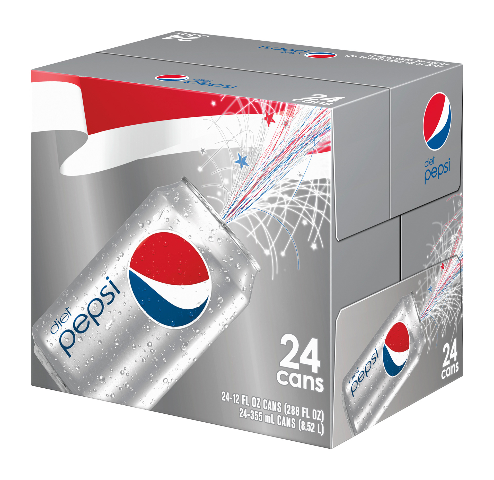
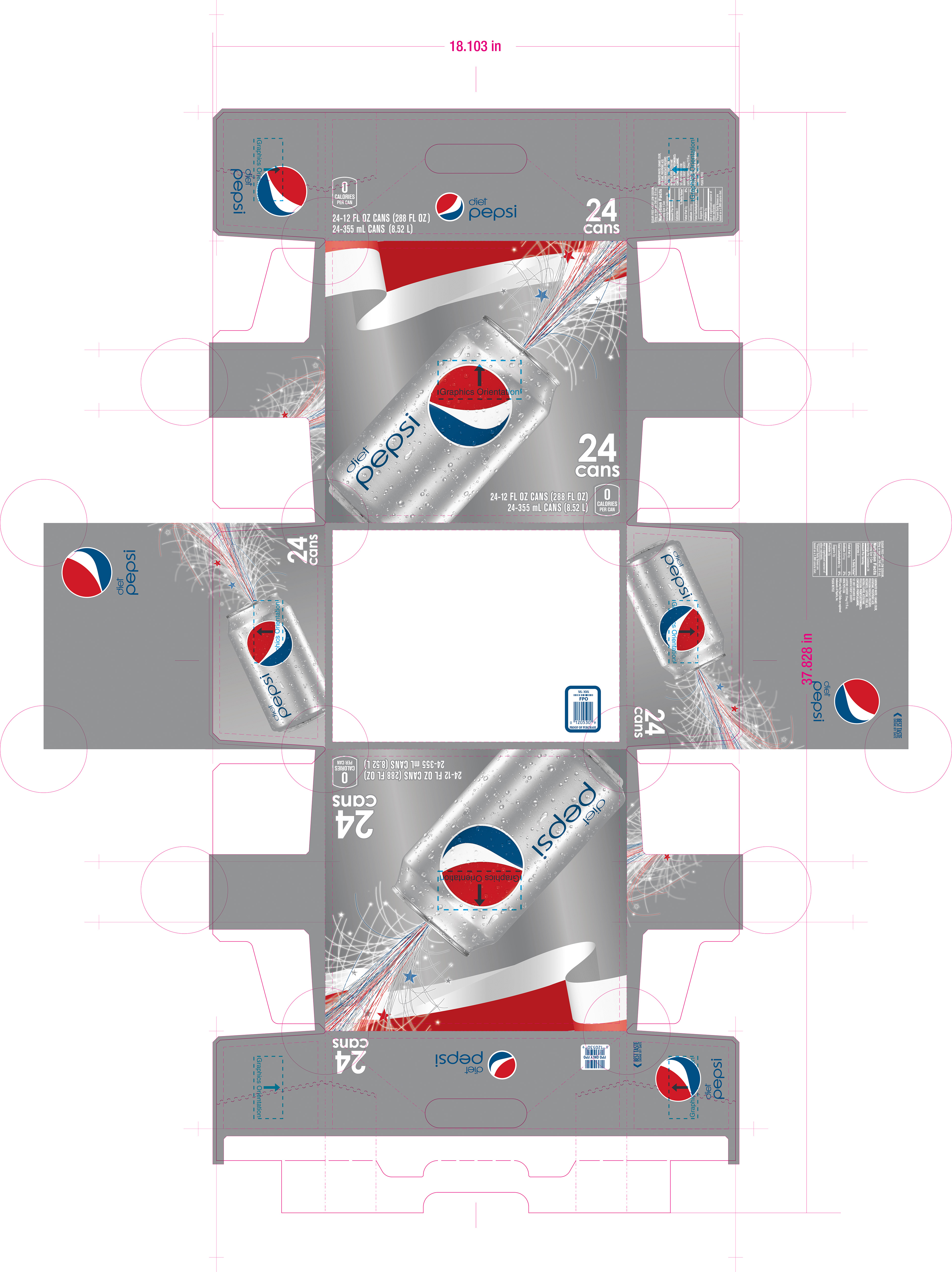
A limited run for Summer, Pepsi released promotional Fourth of July packaging with a patriotic/fireworks theme. Its intention was to create a “billboard effect”, used in seasonal displays one could see at the front of a supermarket, amongst the other Summer paraphernalia for sale. Also, the “billboard effect” continued on the short ends of the packaging for the 12 packs. These are set up on shelves in the soda aisle with the short end facing out to conserve shelf space. The patriotic ribbon would thus continue to the package right next to it. There is an example at bottom of this page from the mechanicals that I have that demonstrates the stacking display "billboard effect". It shows the long panel stacking. The thumbnail for this page is an actual photograph sent to me by my sister who is a manager at Stop & Shop, showing me they were in the process of setting up the display to achieve the desired effect. This image shows the "billboard effect" on the side panels, as well as the long panels in live promotional set up.
I worked closely with the Pepsi art director to ensure everything was up to her standards. We worked closely to develop the concept, which must billboard, sometimes throwing out whole designs. This was the theme ultimately chosen. One of the more demanding art directors, much attention to detail was required to achieve the proper crossmatching. I also had to make sure none of the firework detail would be lost due to dot gain, painstakingly making sure everything was up to at least minimum spec. I handled all layout and production for the Fourth of July packaging in conjunction with the art director. This was a demanding but fun project. We commenced its work at the height of Winter, so it really made us yearn for its warm weather release.