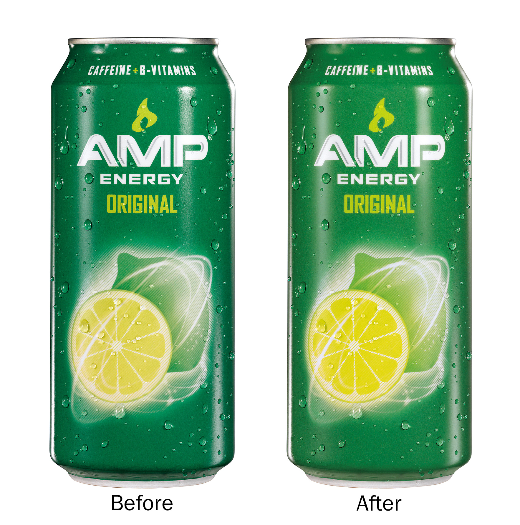
AMP ENERGY
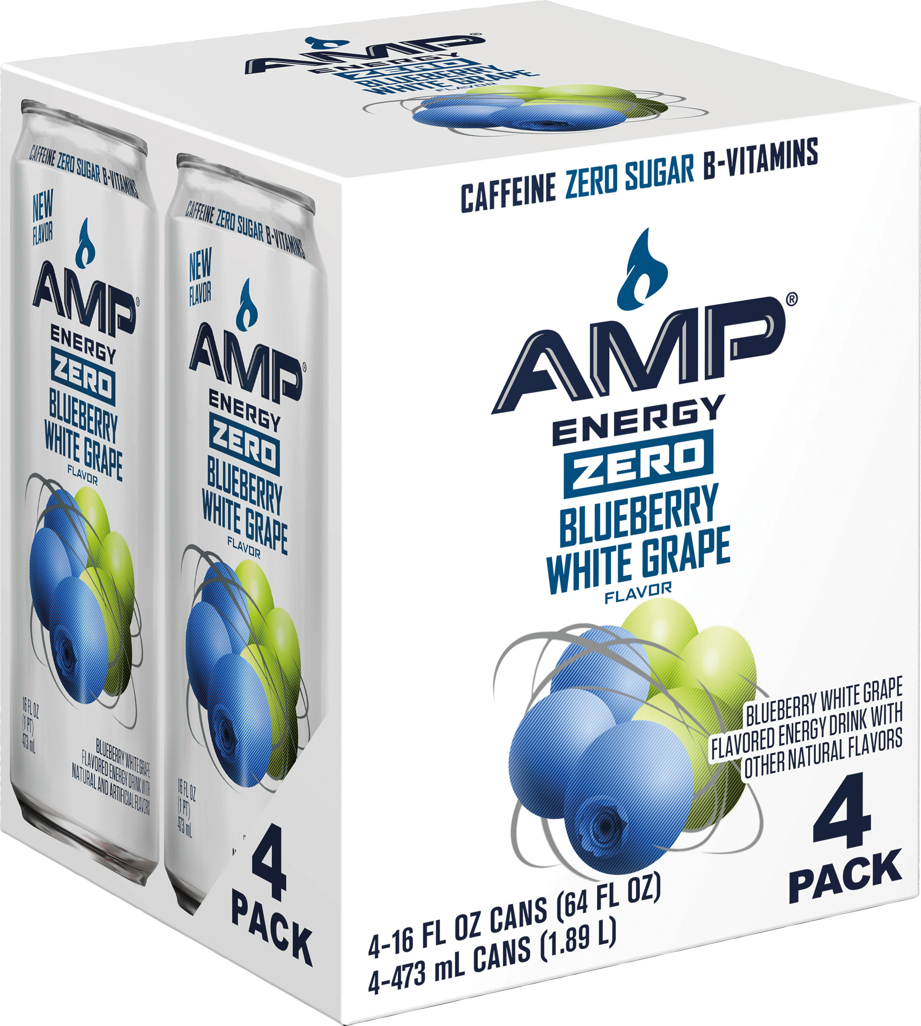
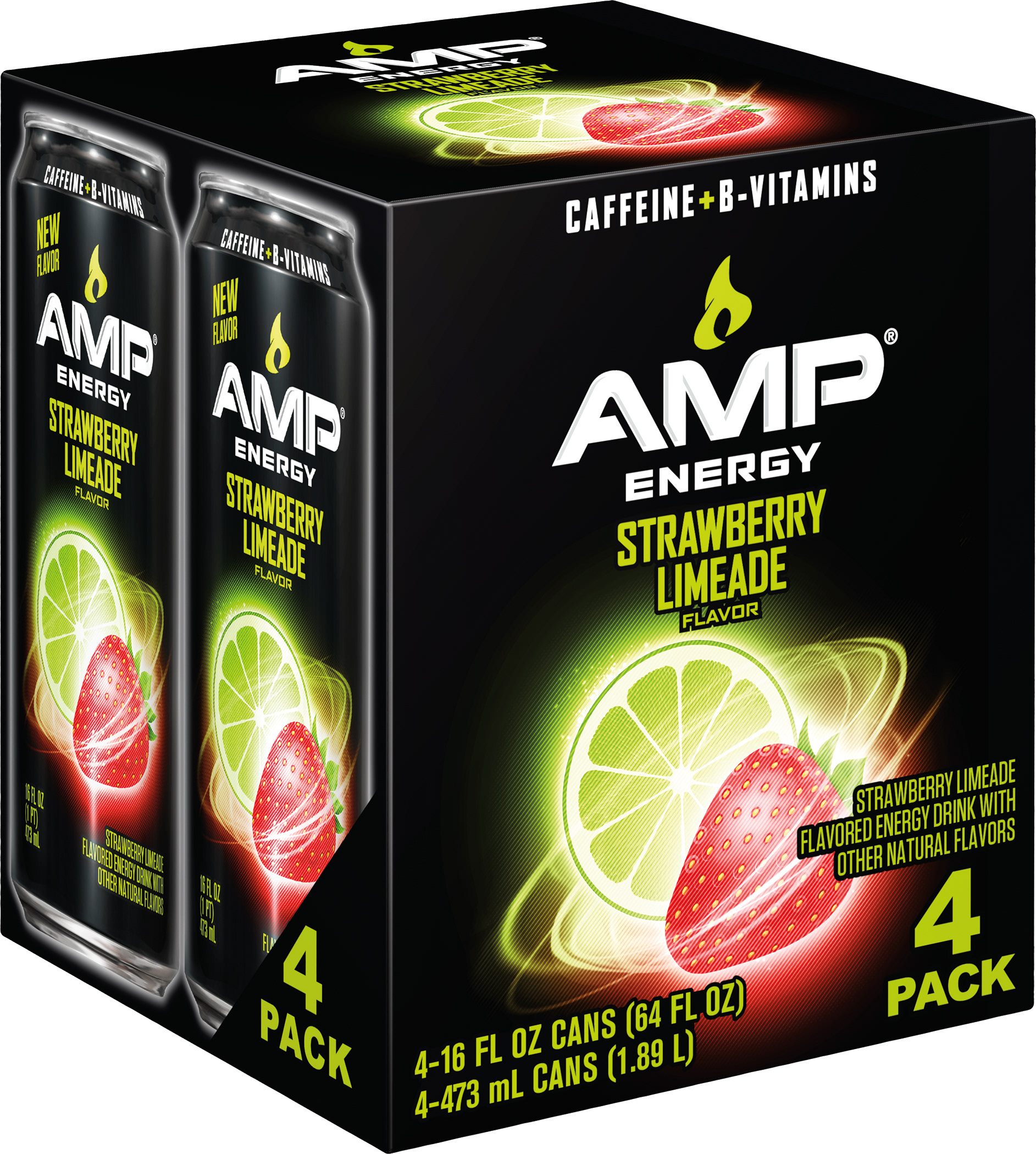
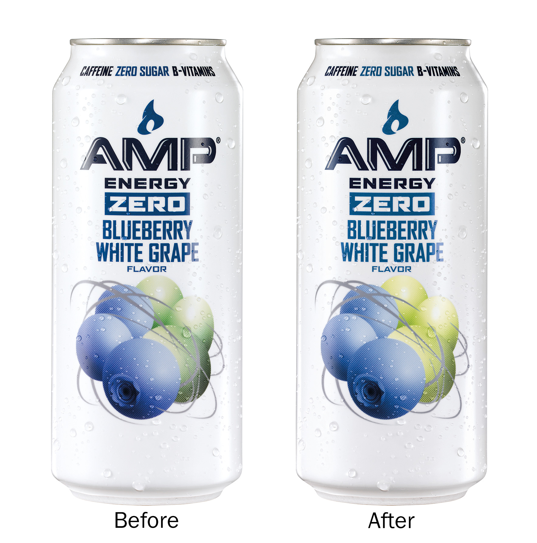
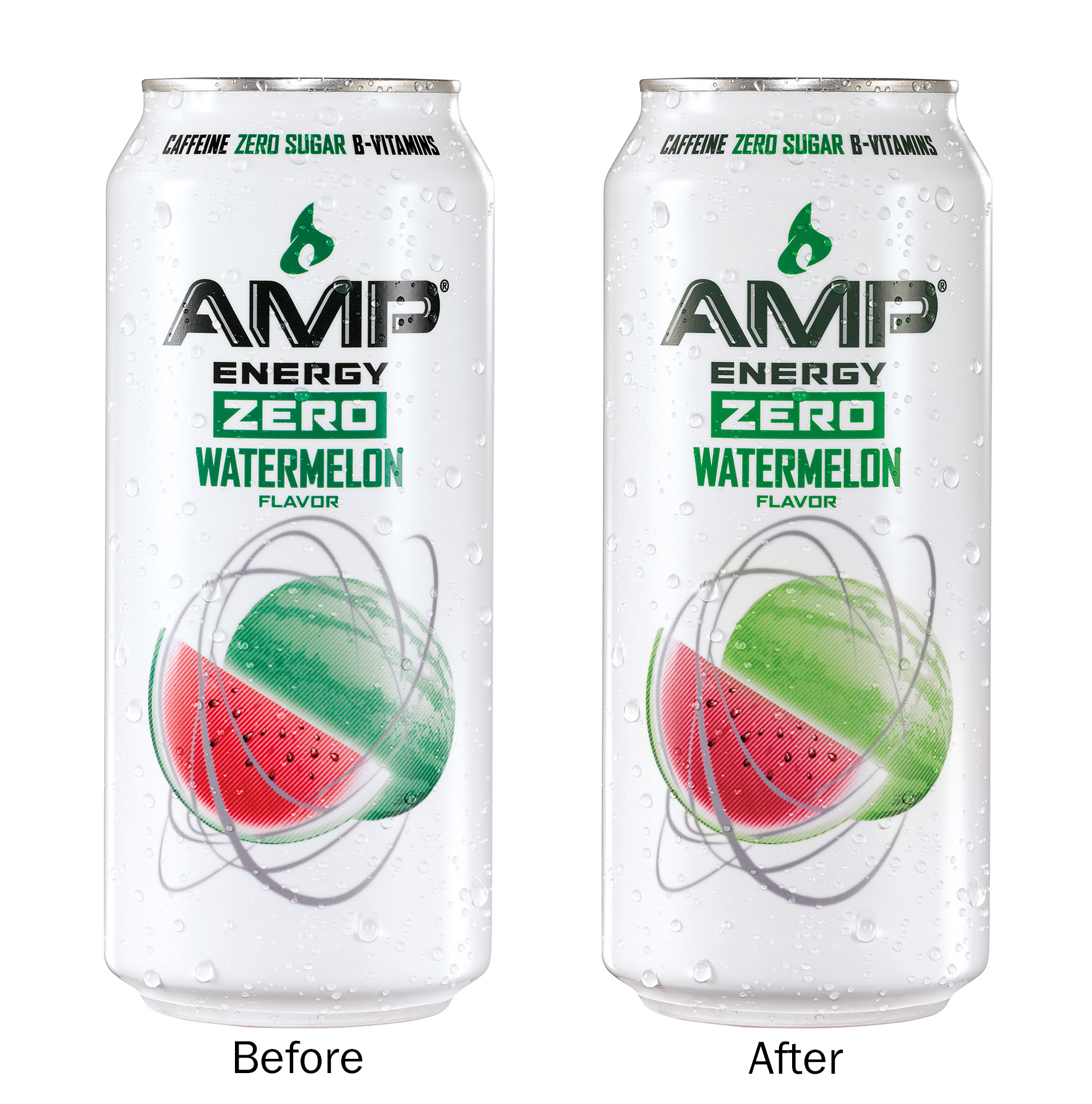
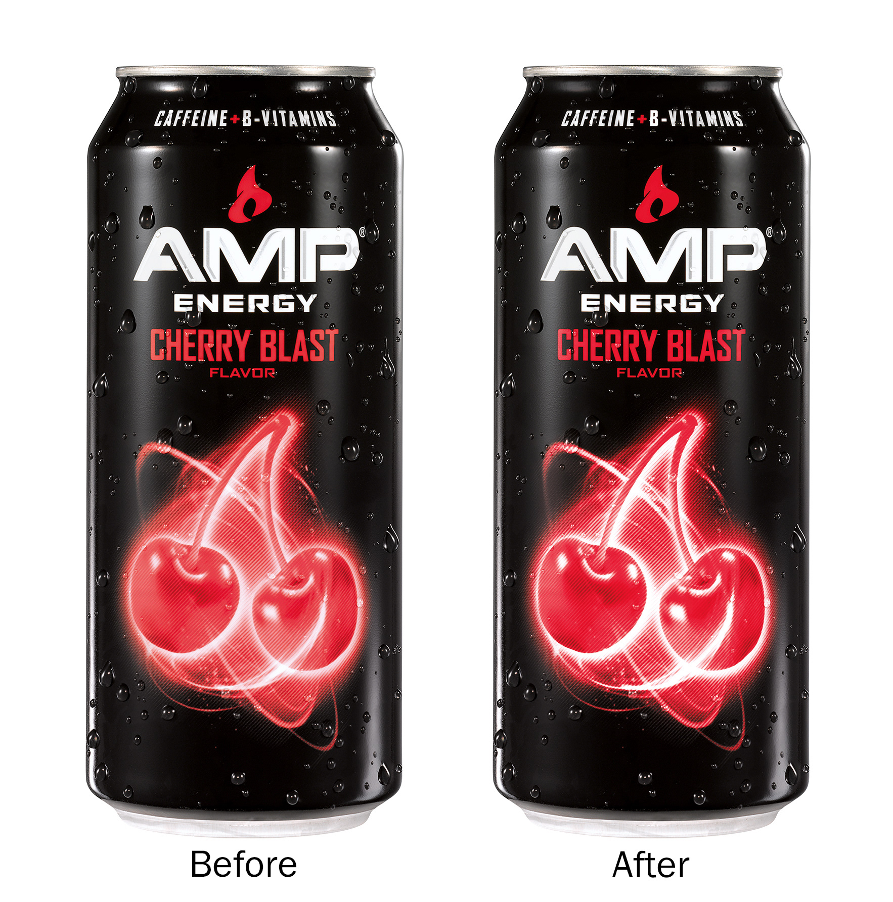
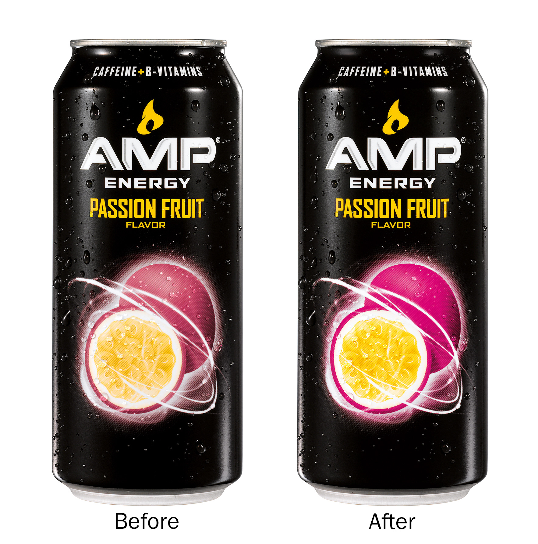
This was the second redesign of the Amp brand in my time at Pepsico. I could post the first redesign I was involved with circa 2012, but the redesign below is the Amp packaging as it currently stands. I worked on the development, production, and the Photoshop work of the fruit imagery. I also handled all e-commerce. I was primary retoucher for all images used on the packaging and promotional pieces (POP, ads, etc.) for this redesign. As always, for the photography, it was important all images match the specified PMS values of the mechanicals. I worked with art directors to meet the expected specs.
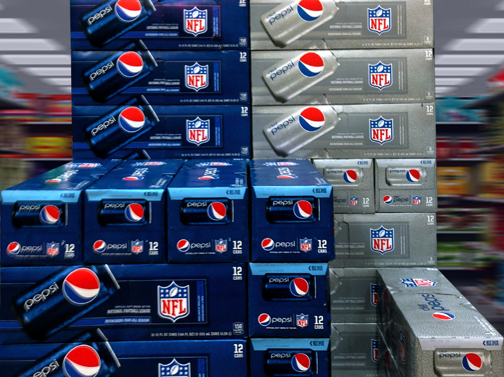
Here are some examples of the packaging these cans came in. These are concepts that eventually became the first round of packaging when the design was "New". I developed these 3D objects in Photoshop that would later be used as masters for e-commerce for all subsequent 16 ounce 4 pack brands.